Importance of Choosing the Right Font for Your Outdoor Signage
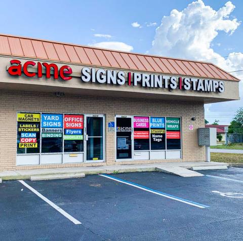
When designing signage for your business, it is important to carefully select the appropriate font. At Acme Signs and Prints, we understand that the font you choose can significantly affect how your brand is perceived. Whether you require Indoor Signs, Outdoor Signs or Building Signs, we can help. In this blog post, we will discuss how to choose the right font, provide some dos and don'ts, and offer insights to help you make informed choices about your storefront signs.
Why Do Fonts Matter in Outdoor Signs?
Fonts are more than simply letters; they have emotions, personality, and style. The right font can enhance your brand's identity, making it easily recognizable and memorable. On the other hand, a poor font choice can confuse your audience or even turn them away. Here are some key reasons why font matters:
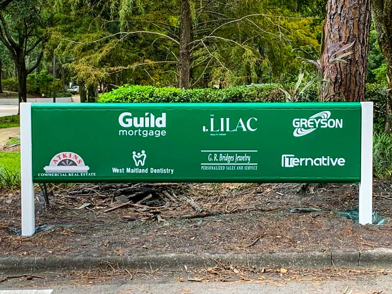
- Reflects Your Brand Identity: The font you select should be consistent with the essence of your brand. If you're a law firm, a formal and classic font might be suitable. For a creative agency, a more modern and unique font could be a better fit.
- Enhances Readability: The primary purpose of a sign is to convey a message. An easily readable font ensures that your audience can quickly grasp the information you're presenting. Avoid overly decorative fonts that may hinder readability.
- Sets the Tone: Fonts carry emotions and set the tone for your message. A bold, sans-serif font may convey strength and modernity, while a cursive font might evoke elegance and sophistication. Consider the emotions you want to evoke and choose your font accordingly.
The Do's of Choosing Fonts
- Know Your Audience: Understanding your target audience is crucial. If your audience is young and trendy, you might choose a modern and stylish font. For a more mature audience, a classic and timeless font might be appropriate.
- Prioritize Readability: Always prioritize readability over style. Ensure that your font is clear and easy to read, especially from a distance. Consider factors like font size, spacing, and contrast to enhance visibility.
- Limit the Number of Fonts: A common mistake is using too many fonts in a single sign. To keep your design consistent and businesslike, limit your font selection to one or two. Using multiple fonts can create confusion and diminish the impact of your message.
The Don'ts of Choosing Fonts
- Avoid Overly Trendy Fonts: While trendy fonts may seem appealing, they can quickly become outdated. Select fonts with a timeless quality to ensure your signage remains relevant for years to come.
- Steer Clear of Complex Scripts: Scripts and cursive fonts, while elegant, can be challenging to read, especially from a distance. Avoid overly complex scripts for main messages and reserve them for smaller, decorative elements if necessary.
- Say No to Comic Sans: Comic Sans is infamous for being a poor choice in many professional settings. It often lacks the professionalism and readability required for effective signage. Choose more appropriate and professional alternatives.
Your Font, Your Brand's Unique Identity
At Acme Signs and Prints, we understand the impact that the right font can have on your signage. By following these do's and don'ts, you can make informed decisions that align with your brand identity and effectively convey your message. Remember, your signage is often the first impression your business makes, so make it count with the right font!
Ready to make a lasting impression with your outdoor signage? Contact Acme Signs and Prints today to discuss your unique needs and let us help you choose the perfect font for your brand!